Overview
Most of the tutorials on the web teach the concepts of CSS Flexbox and Grid using some coloured blocks. You get introduced to all the CSS properties related to these concepts and how they work. But very rarely you get to see some examples of where and how these are used in the real world. Without understanding the real world application, learning is incomplete.
This book takes a completely different approach. I won't teach you the things flex and grid can do. Instead, I will first show you some components and layouts and make you think how to build them using the CSS concepts you already know. Now you have a problem, and you want a solution. That's when I introduce the concepts you "need" to know.
This is called Problem-Based Learning which will not only keep you motivated throughout the book, but also help you retain the knowledge far better.
Who is this book for?
Whether you are a beginner at CSS who's never heard of flex and grid, or someone who knows all the concepts but finding it hard to implement in real projects, or anywhere in between, this book is for you. Even if you're here to just look at some examples and practise your skills, you will find a great collection here.
What are the different versions?
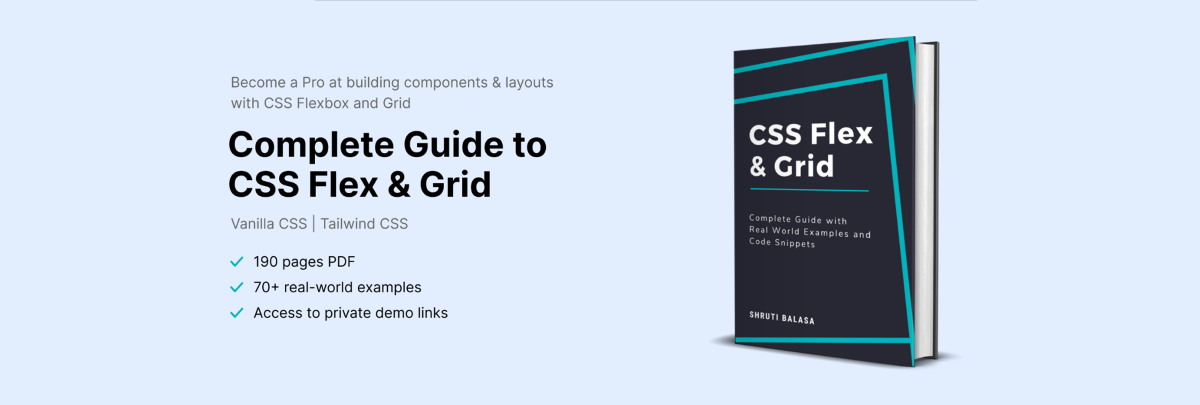
Flex and Grid with Pure CSS You get one eBook (PDF) with all the code snippets, working demos and concepts explained in Vanilla CSS (or pure CSS).
Flex and Grid with Tailwind CSS You get one eBook (PDF) with all the code snippets, working demos and concepts explained in Tailwind CSS.
Pure CSS + Tailwind CSS You get both the above eBooks.
Chapters
-
Who is this book for?
-
How to use this book?
-
Why Flex & Grid
-
Display Flex
-
Example 1a : Quotes Side-by-Side
-
Understanding display : flex
-
Example 2a : Tabs Spaced Out
-
Understanding justify-content
-
Example 2a : Tabs Spaced Out
-
Understanding justify-content
-
Understanding flex-wrap
-
Understanding align-items
Introduction
Who is this book for?
Why Flex & Grid
Justify Content
Flex Wrap
Align Items
Reviews
No review yet.
